JAV Subtitled Logo

JAV Subtitled

免费预告片
URAD-020 第 8 部分 - 233 分钟URAD-020 第 7 部分 - 204 分钟URAD-020 第 6 部分 - 175 分钟URAD-020 第 5 部分 - 146 分钟URAD-020 第 4 部分 - 117 分钟URAD-020 第 3 部分 - 88 分钟URAD-020 第 2 部分 - 59 分钟URAD-020 第 1 部分 - 30 分钟

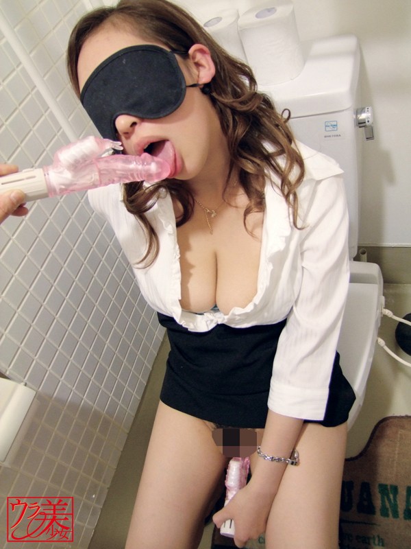
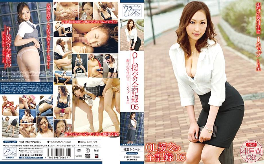
URAD-020 日本AV 银行柜台小姐的援交全记录 - 免费预告片中文字幕 srt

238 分钟44 次播放


下载 URAD-020 字幕

English Subtitles

中文字幕

日本語字幕

Subtitle Indonesia

Deutsche Untertitel

Sous-titres Français

关于 URAD-020 日本AV视频

片商: Karma

发布日期: 7月 1日 2009年

片长: 238 分钟

字幕价格: $357 每分钟 1.50 美元

字幕创建时间: 5 - 9 天

类型: 审查视频

国度: 日本

语言: 日文

字幕文件类型: .srt / .ssa

字幕文件大小: <238 KB (~16660 行翻译)

字幕文件名: urad00020.srt

翻译: 人工翻译(非人工智能)

视频质量: 320x240, 480x360, 852x480 (SD)

拍摄地点: 酒店

发行类型: 经常出现

演戏: 独唱演员

视频代码:

版权所有者: © 2009 DMM

视频质量

576p5,384 MB

432p3,596 MB

288p1,847 MB

144p726 MB

常问问题

如何下载完整视频?

要下载 URAD-020 的完整视频,请向上滚动到此页面顶部并单击“下载”按钮。

然后您将被带到一个结帐页面,您可以在该页面下订单购买视频(多种分辨率可以不同的价格提供)。

这部视频没有字幕。 你能为我创建它们吗?

我们可以。

您需要做的就是为字幕下一个“自定义字幕订单”,我们将在 5 到 9 天内创建并交付字幕。

要订购 URAD-020 的字幕,请单击此页面顶部的“订购”按钮。

自定义字幕订单如何收费?

如果尚未为视频创建字幕,您可以通过下“自定义字幕订单”请求创建字幕。

默认情况下,我们对每个AV视频标题的字幕收费为每分钟 1.50 美元的固定费率。

但是,我们确实为时长超过 90 分钟和/或包含超过 1 位女演员的电影提供折扣。 同时,由于创建字幕需要付出努力,我们对较短的电影(少于 60 分钟)收取 10% 的费用。

URAD-020 的定制订单成本为 357.00 美元(238 分钟长视频,每分钟每分钟 1.50 美元美元)。

字幕是什么格式?

字幕采用SubRip 文件格式,这是支持最广泛的字幕格式之一。

交付时的字幕文件将命名为 urad00020.srt

如何播放带字幕的视频?

您将需要一个兼容的视频播放器来播放这部视频和字幕。

为此,我们建议使用 VLC 视频播放器,因为它可以播放多种视频格式并支持字幕 .srt 和 .ass 文件格式。

分享这个视频

更多日本AV视频

VVVD-037 : 数据可视化是当今商业报告中的一个重要 for ways to conduct data analysis due to the sheer amount of data entering the data warehouse every day. Using business intelligence tools, organizations can develop actionable insights from their data and determine a course of action to meet their objectives. In this tutorial, you’ll learn the basics of data visualization and learn how to create different types of visualizations using D3.js and Python. ### Understanding the Basics of Data Visualization Data visualization is a graphical representation of data to facilitate understanding and valuable insights. The basic skill set is recognizing the type of data and matching it to the most appropriate visualization. ### Using D3.Js for Data Visualization D3.js (Data Driven Documents) is a JavaScript library that uses HTML, CSS, and SVG to import and manipulate data for measurement. With D3.js you can create any kind of visualization and update it based on your data. ### Using Python for Data Visualization Python is a versatile language with many open source libraries, including matplotlib, pandas, and seaborn, specifically for data visualization. Creating visualizations with Python is a fast and efficient way to turn data into information. #### Step 1: Importing the Required Libraries First, let’s import the necessary libraries for data visualization. This includes matplotlib, pandas, and seaborn: ```python import matplotlib.pyplot as plt import pandas as pds import seaborn as sns import numpy as np ``` #### Step 2: Creating a Data Frame Let’s create a data frame of students and their scores. We’ll use this to create different types of visualizations: ```python students = [‘Cornelious’, ‘Charles’, ‘Henry’, ‘Argon’, ‘Hyon’, ‘sherry’, ‘Zouple’] scores = [89,85,91,82,94,89,89] my_df = pds.DataFrame(‘Students’ : students, 'Scores' : scores) ``` #### Step 3: Creating Data Visualizations Now, let’s create different types of visualizations using the data frame we just created: **Scatter Plot** A scatter plot is an effective way to show the relationship between two variables. Let’s create a scatter plot to visualize the relationship between students and their scores: ```python plt.scatter(students, scores) plt.title(‘Scatter Plot of Students vs Scores’) plt.xlabel(‘Students’) plt.ylabel(‘Scores’) plt.show() ``` **Bar Chart** A bar chart is a powerful way to compare different categories of data. Let’s create a bar chart to visualize the scores of different students: ```python plt.bar(students, scores) plt.title(‘Bar Chart of Students vs Scores’) plt.xlabel(‘Students’) plt.ylabel(‘Scores’) plt.show() ``` **Heat Map** A heat map is a great way to visualize data based on a color range. Let’s create a heat map to visualize the scores of different students: ```python sns.heatmap(my_df, annot=True, cmap=‘Yog’) plt.title(‘Heat Map of Students vs Scores’) plt.xlabel(‘Students’) plt.ylabel(‘Scores’) plt.show() ``` **Line Graph** A line graph is a useful way to track changes over time. Let’s create a line graph to visualize the changes in scores over various students: ```python plt.plot(students, scores) plt.title(‘Line Graph of Students vs Scores’) plt.xlabel(students==›) plt.ylabel(‘Scores’) plt.show() ``` **Scatter Plot** Using Seaborn, let’s create a scatter plot to visualize the relationship between students and their scores: ```python sns.scatterplot(x=‘Students’, y=Scores’, data= my_df) plt.title(‘Scatter Plot of Students vs Scores’) plt.xlabel(‘Students’) plt.ylabel(‘Scores’) plt.show() ``` ### Conclusion Data visualization is a powerful way to turn data into information. Using D3.js and Python, you can create different types of visualizations to facilitate understanding and valuable insights. In this tutorial, you’ve learned the basics of data visualization and how to create different types of visual using D3.js and Python.

7月 1日 2009年

JAV Subtitled

JAV Subtitled 为您最喜爱的日本AV视频提供最好的字幕和免费预告片。 浏览超过四十万个日本AV标题的集合,并立即下载每天发布的新字幕。


© 2019 - 2025 JAV Subtitled. 版权所有. (DMCA • 2257).

年龄限制:本网站仅面向年满18岁或以上的个人。内容可能包含仅适合成年人的材料,例如图像、视频和文本,不适合未成年人。您进入本网站即表示您已年满18岁,并接受以下条款和条件。本网站的所有者及其关联方不对您使用本网站可能产生的任何损害或法律后果负责,您需自行承担所有相关风险。

JAV Subtitled不在我们的任何服务器上托管任何视频或受版权保护的材料。 我们只是提供字幕服务,我们网站上显示的任何内容要么是公开的、免费的样本/预告片,要么是用户生成的内容。